A picture of yours truly Self portrait of me wearing armour Self portrait of me imagined as cyberpunk Self portrait of me as an elven king Self portrait of me as a stylish dude in a suit Self portrait of me wearing a bad ass helmet Self portrait of me as polygons

Dallas Ransom

Human Centric Designer

Interaction • UI • UX • Product • Front End Developer

Folio

Here is a collection of some of the projects, both personal and professional. Please enjoy.

UX, Interaction, UI and Front End Development

Hearing Australia

Hearing Australia Logo

Service Victoria

The Service Victoria Logo

Super SA

Super SA Logo

Services Australia

Australian Government Coat of Arms

Optus

Optus Logo

Carbon Planet

Carbon Planet Logo

Web Design and Development

Dallas Ransom Duogram

Food Drop

Food Drop Logo

Graphics, Art, Illustration & Design

ISO B&W

Isometric Black and White Illustrations

Squeaky Team

Thumbnail Image of the Squeaky Team

Logos

The logo for the Woolcock Group

Misc

Illustration of a giant fish

Design of Things

The Pup Bed

Image of the Pup Bed

The Radius Desk

Image of the Radius Desk

The Happy Side Table

Image of the Happy Side Table

About me

  • Based in: Adelaide, South Australia
  • Citizenship: Australian Citizen
  • Work Location: Remote (if possible)
  • Preferred work: Contract

Given my experience in design, product development and front end development, I am best placed in lead or product ownership roles.

I focus on measurable, tangible outcomes for business by developing processes that support the people and relationships that drive business value.

Where I see my value

I have always seen my role as the person that brings a product vision to an IT project, similarly to the way an architect brings a vision to a construction project. I formalise the vision with super high fidelity prototypes - so high in fact, the devs don't need to code the UI if they don't want to. I refer to this as a 'Product First' approach or 'UI Architecture'.

This is just a smattering of the work I have done over the years.

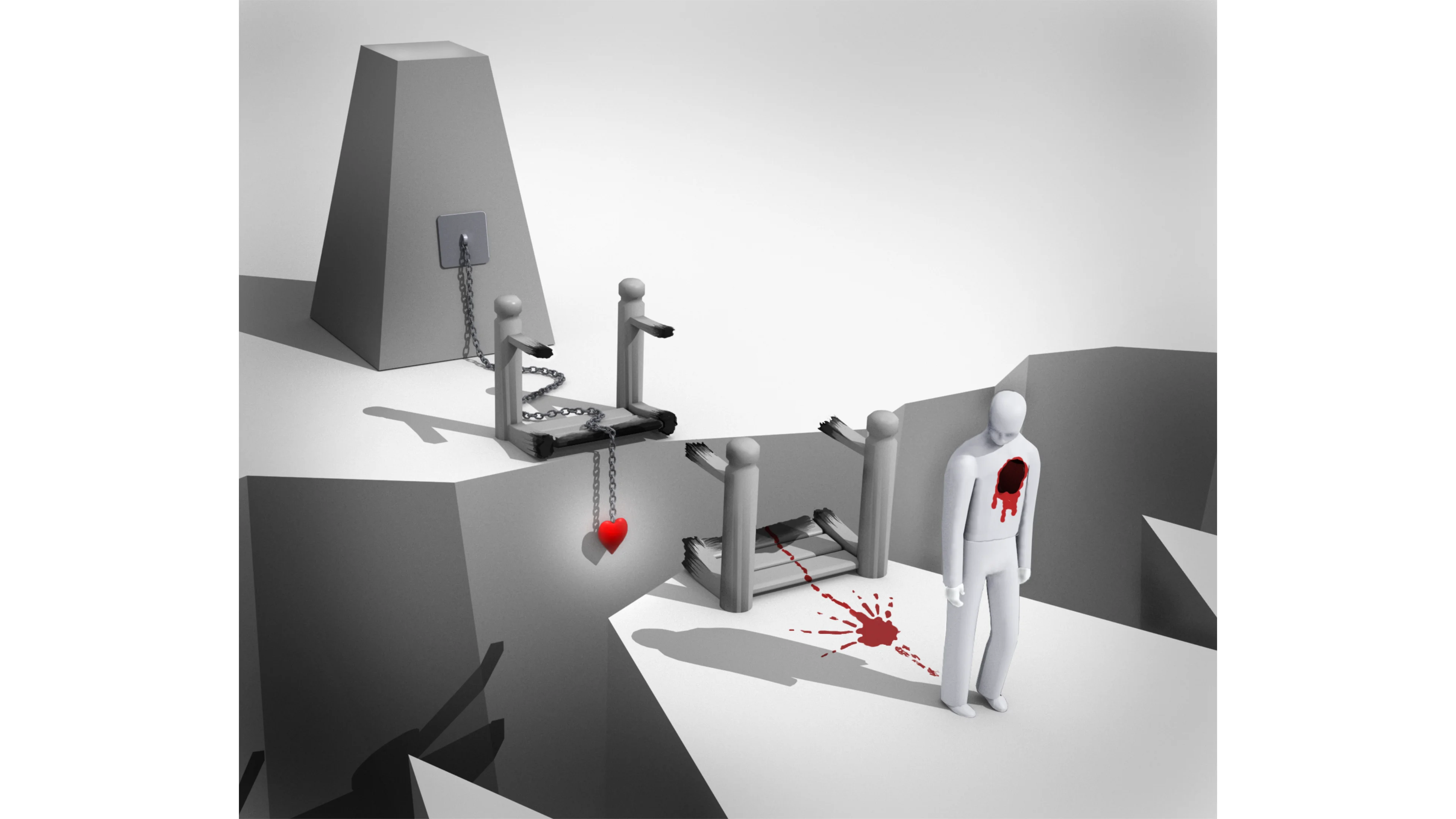
By the early 2000s, it was clear to me that most IT projects lacked a vision of the final product, contributing to the metric of the day that '80% of all software projects failed'. Unlike any other product centric industry, IT lacked a design phase focused on product usability, instead relying on traditional engineering practices to deliver software.

Culturally, traditional IT has always been quietly skeptical of 'design' because it was seen as a superficial, non-essential part of the process, widely regarded as a luxury. There was no acknowledgement that if the product worked well and was easy use, it was a boost to business productivity and the bottom line.

I learned how to build software from an opposing perspective to traditional engineering, focusing first on the usability requirements pertaining to the needs of the users. Once I am provided a brief, I can envision the application with it's main areas of functionality, and screen by screen, I design and build the UI discussing requirements and fleshing out functionality with stakeholders as I go.

The process of developing the functional scope through the development of high fidelity UI prototypes is an effective way to:

This is all before a team of developers need to be engaged to build the application. When they are engaged they have a complete prototype on which to base their effort estimations, allowing for more accurate cost and time frame estimations for the completion of project milestones.

What can I do for your business or team?

I can help you with the following:

  1. Product Evaluation

    Are you working on, or does your business use an app that you feel could be improved, but you're uncertain exactly how? I can evaluate the product and provide a report on how it could be improved in the areas of usability, accessibility, layout, precognitive strategy, cognitive functional arrangement, process efficiency, feature inclusion and style.

  2. Product Development

    Do you have an idea for a product but you're not sure how to get it off the ground? I can help you develop the product from concept to prototype, including the development of a design system, a functional scope of work, a high fidelity prototype and a user testing strategy.

  3. Product Ownership

    Do you have a product that needs a product owner? I can take on the role of product owner for your product, managing the development team, the product vision, the product roadmap, the product backlog and the product strategy.

  4. Design System Development

    Do you have a product that needs a design system? I can develop a design system for your product, including a style guide, a component library, a pattern library and a UI architecture.

  5. Front of Front End Development

    Is your team having trouble delivering a bespoke, responsive, accessible, cross browser compatible UI? I can build and debug HTML layouts, helping your team deliver a UI that meets all of these requirements.

Skill Sets

(Front of) Front end development, HTML, CSS/SCSS, Javascript, web animation, feature ideation and strategy, components and frameworks, accessibility, responsive layouts, cross browser compatibility, Agile, version control and various 'DevOps' apps including Jira and Gitlab.

UX Research, business analysis, UX Design, interaction design, information architecture, wire-framing, prototyping, user testing, usability testing, accessibility, design systems, design thinking, design sprints, design strategy, design leadership, design management and design systems.

Product development, 3D modelling, animation and printing. Graphic design, branding, logo design, icon design, illustration, and copy writing.

Work History

Senior UX Consultant, Hearing Australia

September 2022 - April 2023

I was contracted to Hearing Australia to work as a Senior UX/UI consultant to design and build their web site, being a part of a greater project of a business wide digital transformation.

Senior UX Consultant, Tori Consulting

December 2021 - May 2022

Starting in December 2021, I was seconded to Service Victoria to work as a Product Shaper for their digital service offerings. Predominantly working in the mobile space, my role was to design new features to be deployed for the Service Vic mobile app. I also worked in the web space on the Business Licensing initiative, a service that allows councils to transform their existing administration services to the digital space.

Senior UX Consultant - Empired + Intergen

April 2021 - December 2021

I was approached to take on the role for Senior UX Consultant for the Empired+Intergen Consulting Agency. My work there included designing UI for Power Apps for the Department of Education, the (multi-award winning) Super SA web site , Parliament of South Australia Members lounge kiosk, consulting on the UI of one of Empired's Sharepoint products and developing a Reporting Principles style guide for the Department of Education.

UX Designer Services Australia - December 2017

December 2017 - July 2020

During my time at Services Australia I was lucky enough to be on a project team at the inception of an application and see it through to hand over. Employed as part of the Analysis Practice as a UX Designer, my role covered many areas including Graphic Design, Analysis, Accessibility Development, UI Design and Front End Development.

I worked in a SAFE Agile environment using Adobe CC, Jira, Gitlab, Git CI, Visual Studio, Angular, MS Office and for the first time ever, Windows, to engage with stakeholders and produce friendly analysis documents, graphics, icons, UI for my great dev team (DARC Web) and stakeholders.

UX Designer at Optus

December 2015 - July 2017

I was brought aboard Optus to help with the adoption of a Salesforce based Social Platform called 'Chatter' that Optus Comms was using to deliver company wide communications. This was to be done by re-skinning it and plying it with an Optus branded, friendly UI. I was quickly adopted by the Salesforce team as the UX Designer, participating in over 20 projects ranging from developing logos and icons for Salesforce, to programming deeply detailed working prototypes of company facing software apps in the retail arm, Augmented Reality research and developing concepts for store interiors in 3D.

Senior Developer at Atomix

December 2014 - March 2015

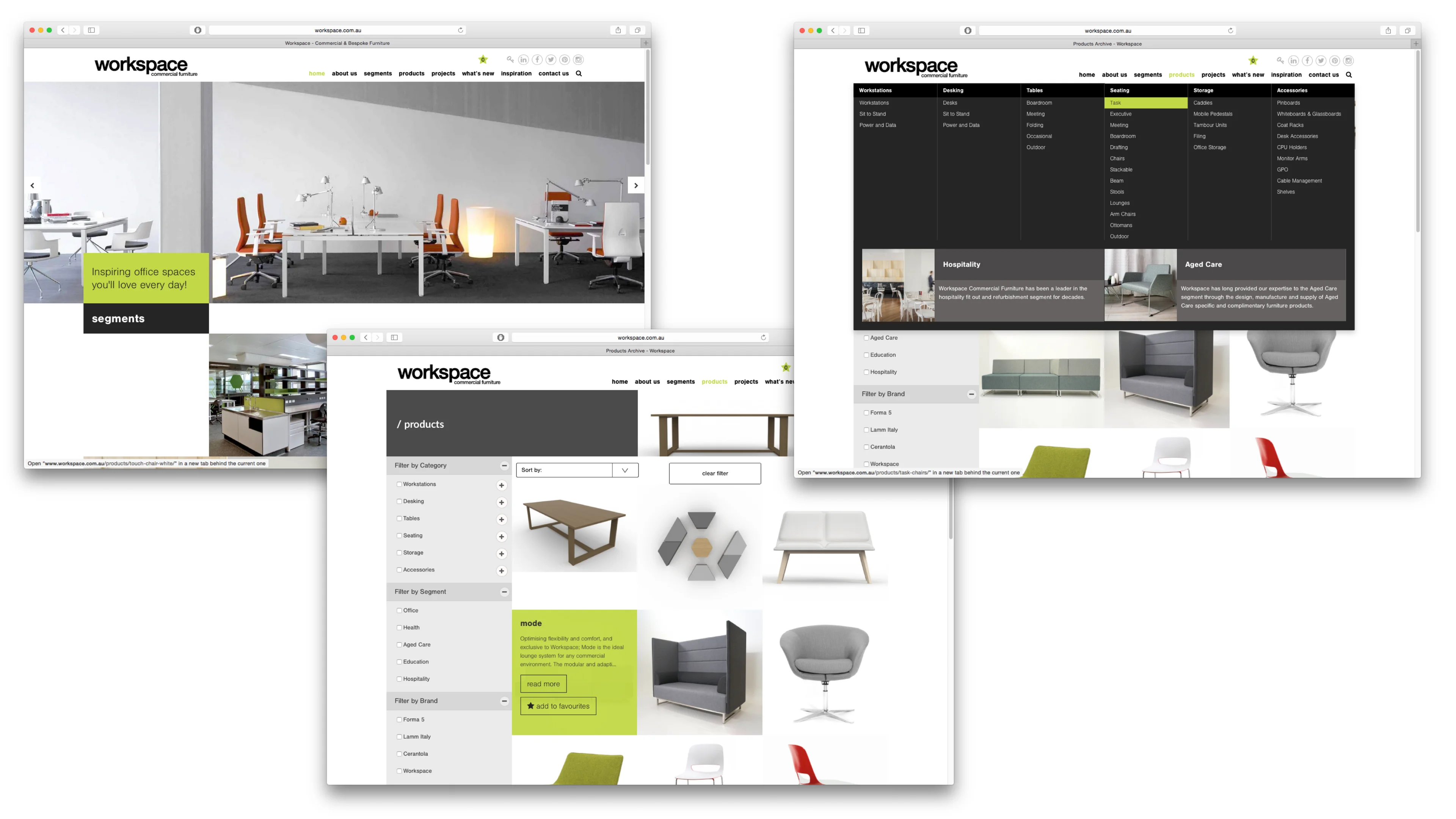
During my brief (yet intense) stint at Atomix, situated in North Adelaide, I worked on workspace.com.au and the zoossa.com.au multi-site that includes adelaidezooo.com.au and monartozoo.com.au. I also contributed as a writer for their procedures knowledge base.

Freelance

July to December 2014

Funny little patch of work where I obtained 6 clients all running for council elections in Adelaide, needing campaign collateral in the form of flyers, letters posters and web sites. I produced their collateral and wrote campaign letters, engaging in discussions concerning election strategies and so-forth. A very pleasant bunch of people to deal with. 3 of them got elected.

Produced another web site for James Knowler. A very simple website designed to show off his work and make it easy to navigate. Also simplified the backend processes for James making it simple for him to organise his images. The site is also completely responsive.

Pangolin Associates are commercialising the research they have done and are making an effort to become more marketable. They approached me for some design work resulting in logo development for two businesses, 'Energy Buster' and 'Sustainable Savings.'

Consulted on UX for Sustainability House's public facing software for calculating building energy efficiency. After an in-depth study of their app, I provided branding and a document with a strategy for improving their software.

Web Edge

September 2013 to July 2014

Senior Developer, Full time contract working mainly on jayco.com.au but also other small jobs including a responsive landing page for Classic Timber Furniture.

Freelance Designer/Developer

August 2012 - September 2013

Senior Technical producer, Kojo

August 2011 - August 2012

Full time permanent position. Responsibilities included production management, project management/coordination, client management, IT Strategy Consulting, business analysis, tender/proposal writing, writing technical briefs, writing learning system modules and HTML/CSS/Javascript development, for clients including Mitsubishi Motors and BHP Billiton.

UI Designer

March - July 2011

Jackson Care Technology employed me for a 3 month contract to design the UI for a browser application that managed the set up, configuration and notification system to be used in hospitals and aged care facilities.

Freelance

July 2010 - MARCH 2011

Projects in this period included:

Design Manager, Carbon Planet

February 2006 - July 2010

Carbon Planet was carbon management company that started out by retailing carbon credits. Carbon Planet originated and traded carbon credits and consulted on carbon credit project development. They provided 'carbon education' - an education pack for schools, built web based carbon management software, provided carbon and energy audits for business and retailed carbon credits through the web site. They were also enagaged in some carbon credit origination projects.

As the 'design manager', my job was to design and build the web site, the interface and branding for the carbon management software (G3MS), and all sales collateral published by Carbon Planet.

I also co-wrote 2 papers presented submitted to the Copenhagen climate summit.

Freelance

2001 - 2006

I'll gloss over this part of my career as it was simply a time where I was working from home. I had many clients and my work was enjoyable. I did a lot more illustration, animation and arty kinds of things during this time. Most of my clients were small businesses with small budgets.

Senior Designer/Interface Architect, Recall Design

2000 - 2001

At Recall Design I worked with stakeholders to develop the scope and interface prototypes for enterprise web applications. Clients included MYOB, Citibank.

Lecturer - University of South Australia - 1999

Spent a semester teaching art students how to make web sites.

Director, The Tomato Consortium

1996 - 2000

Co-started a business in 1996 with Mark Ingman in computer graphics and design. The company soon morphed into a web development company and in 1997 won the Telstra web awards for 'Australia's Best Sporting web site' for the South Australian Cricket Association 'RedBacks' web site. Clients included Victoria Parks, PIRSA, State Theatre, Animal Welfare League and the University of South Australia.

References

Professional

Matt Wicks
SSW, Solution Architect

Kiriana Meha-Bettison
Project Manager, Hearing Australia

Stephen Molloy
Senior Product Designer, Service Victoria

Darren Whitelaw
Chief Customer Officer, Service Victoria

Mathew Pigram
Full Stack Developer, Team Lead, Services Australia

Faiyaz Khan
Full Stack Developer, Team Lead, Services Australia

Tony Yuen
Project Manager, Optus

Personal

Mark Ingman
Full Stack Developer

Alex Blood
Senior Executive / Transformational Leader / Board member / Innovator / Social and Enviro Sustainability

Vivienne Holloway
Strategic Projects Consultant

Back to folio

Hearing Australia Web Site Transformation

Hearing Australia
Senior UX Consultant
2023

Hearing Australia is a great company filled with wonderful, hard working people. They are the largest provider of government funded hearing services in Australia and have been around for over 75 years.

Hearing Australia employed me for a 6 month contract to help them redesign their web site as part of a larger company wide transformation. My role was to lead the UX design and research for the project, working with the product owner, Kelly, and a team of 3 developers from SSW to rebuild their web site with Kentico CMS.

This was a concept for the mobile experience which was surprisingly important. Despite that the majority of Hearing Australia's customers are over the age of 70, the larger user demographic of the web site were people in their 30s, suggesting that a lot of people were looking for information for their parents or their children.

Early on, it was impressed upon me that Hearing Australia's competition in the Hearing Health industry had more than tripled the marketing spend over the previous 4 years. Hearing Australia had to become a competitive entity within the industry and therefore the UX needed to be industry leading.

I approached the task as I usually do, producing a documented analysis of the existing digital assets and user behaviour thereof, shaping the strategy for the transition.

I defined the user journeys of people from different demographics and completed a layout of the landing page, all within the first two weeks, which was received well.

The booking process was a key user experience. I interviewed several people about the processes and information required in order for the system to be able to accurately "triage" the needs of the user. It wasn't triaging so much as determining the length of the appointment based on the users' needs. I made sure the web site UI to made the booking process a visually persistent feature of the site.

I designed the site to make the Hearing Australia brand more of a lifestyle brand, to advocate for those with reduced hearing health by presenting the idea that hearing health issues are common and don't have to negatively impact lifestyle.

An early concept for the web site, placing all of the most common reasons for visiting the site and compelling reasons to become a customer above the fold, while presenting sincere messaging about children, the elderly and First Nations care on the home page, below.

I also tried to impress that hearing health is a familial issue with which the user is able to assist, and that Hearing Australia is the best place to go for hearing health and care. These narratives were actually cobbled together from the previous web site but you had to dig for them. I put them on the home page where they would be of the greatest value.

This approach was met with a fantastically positive response from the Customer Experience Director. I got rounds of applause and gasps of wonder and the Marketing Head, Bernadette, offered me a permanent role once my contract was up.

User Persona Documents

Analysis of external personas that would use the web site

User Persona Documents

User analysis documents help to determine a functional scope of work through analysis of user types defined by the relationships the business has with the users, the users' needs and the business goals for those users.

I developed 2 documents for Hearing Australia, one for internal users to assist with understanding the functional scope for people within Hearing Australia and one for external users, to understand the functional scope for customers.

Customer Journey DOcuments

Example of the client journey for a young person

Customer Journey Documents

Customer Journey documents are a great way to show how a users would interact with the Hearing Australia.

I provided Hearing Australia 3 separate customer journeys for 3 different demographics. This helped the Hearing Australia to understand how different users interact with the business and how they can become customers. It highlighted aspects of the business that Hearing Australia wouldn't ordinarily consider, such as the importance of making their free hearing test visible, or why relationships with health practitioners are important.

When the business goal is to increase your customer base, documenting these journeys provides the business with insights into how to achieve that goal.

Booking Form Analysis

An early iteration of the Hearing Australia booking process analysis.

Booking Form Analysis

This is an early iteration of the booking flow for Hearing Australia. Hearing Australia wanted a very sophisticated booking flow that was able to determine the length of the appointment based on the users' answers to a series of questions.

To do this I interviewed several people about the information required to determine the correct appointment for their specific clients, which could be either new, existing, child, adult and First Nations clients.

I wanted the booking flow to be able to be entered from multiple spaces on the site, including the clinic locator and the hearing test page and made sure it was a persistant feature of the page in the top navigation.

Home Page Concepts

Hearing Australia initial home page concept prototype

Home Page Concept

This is the initial home page concept I provided to Hearing Australia. It was designed to come across as a lifestyle brand, normalising hearing loss and encouraging people to get their or their loved ones' hearing tested.

I made sure prospective customers quickly understood why Hearing Australia was a good choice, and placed Hearing Australia's best selling points above the fold on the home page, giving prospective customers every reason to become customers.

I had to rush the design and get it out in 3 days. The design was very well received and the Customer Experience Director, Liegh Shaw, literally screamed and clapped when she saw it and Bernadette, the Head of Marketing offered me a permanent role at the end of the contract.

Back to folio

Service Victoria Mobile App

Tori Consulting
Product Shaper
2021-2022

In 2021/22, I was employed by Service Victoria to be a 'product shaper' for the Service Victoria app. We were in peak COVID at the time, and my role was to map out the processes for features to be added to the app, such as a feature for recording, reporting and displaying Rapid Antigen Testing results.

The job, basically, was being asked, 'How would we...?' and 'What would it look like if...?' and I would map the processes and the UI required to do it and send back nice, aesthetically pleasing documents that were the blue prints for how it could be done.

Thanks mostly to the pandemic, the Service Victoria app picked up the award for 'Most Downloaded App on The App Store'. This accolade was leveraged to exponentially boost the budget and thus the project was awash with cash and possibly also drunk on power.

During the my time at Service Victoria, I completed a variety of work including:

The high level concept for the Grants Victoria administration system. I was excited to be given this job because I love designing systems from scratch, especially administration systems. Although, I was surprised when they wanted a design for the system in 2 days.
  • A critique of the Service Victoria mobile app and suggestions for improvement around digital identity, onboarding, searching services and account management
  • Designed a process for recording and reporting Rapid Antigen Testing results in the mobile app
  • Designed layouts and processes for web based business administration services between Service Victoria and the councils of Victoria
  • Co-designed a customisable dashboard view that solved issues around promotional information and the customers needs for the mobile app
  • Designed a systematic approach to implementing and creating verifiable digital identities for Services Victoria
  • Designed a system process for managing vaccination statuses for Services Victoria and how that would look in the mobile app
  • Designed a process for onboarding user for notifications for the mobile app
  • Designed a high level system design for an administration system for Grants Victoria
  • Designed several processes of varying complexity for notifying high risk users of their next vaccination
  • Designed an approach to implementing layered security for the Service Victoria mobile app
  • Partially designed the administration of notifications through the app for departments within Service Victoria
I was asked to scope out functionality for Rapid Antigen Testing. Initially it started as a simple 'test, scan, save and show' process. However, UX at Service Victoria was to brainstorm anything that could possibly be added and throw it in to the design.

I had never worked in such a large team. Every feature was ensconced in executives, product shapers, product directors, product leads, user researchers and UI elaborators. There was also outsourced usability testing and user acceptance testing facilities and a couple of teams of developers. So hardly anything got done.

Service Victoria App Critique - Onboarding

Service Victoria App Critique - Onboarding

Service Victoria App Critique - Onboarding

I was asked to put together a critique of the Service Victoria Mobile app. This is a page from the presentation that set me in bad stead with some of the team at Service Victoria. It quickly became apparent that criticism was not tolerated.

I was extra critical of the 'COVID tool kit' because it had all this 'stuff' such as the 'check in history' and 'check in favourites' that seemed redundant to me. I believed that all that was actually needed was to scan a QR code get a confirmation screen and that was it - you shouldn't even need to open the app.

That was before it was explained to me that the app didn't actually report people's movements to the government due to privacy concerns. It was up to them to check their location history against the locations of outbreaks, hence all the UI clutter and perhaps the record breaking lockdowns.

Service Victoria App Critique - Pre Account Layouts

Service Victoria App Critique - Pre Account Layouts

Service Victoria App Critique - Pre Account Layouts

This is an example of the alternative approach I wanted to the see the app take, before I realised all this work would barely be even be considered, let alone deployed. This seemed to be the way things went on the UX front.

I approach app design, especially mobile app design, with the philosophy that every pixel on the screen must provide value to the user. Fluffy paragraphs of text welcoming users to the app is not something a user would feel was important, especially when they just want to get something done.

Service Victoria Digital Feature Formalisation Flow

Service Victoria Feature Formalisation Flow.

Service Victoria Digital Feature Formalisation Flow

This is a proposal for a process for introducing and formalising features for the Service Victoria mobile app. For a while there was a some indecision what was to be deployed and prioritised so nothing was getting done. I spent a lot of time just waiting for work to come across my desk.

There was some discussion about the correct way to qualify design and deploy features for the app and this was my contribution. It garnered no feedback - which was par for the course at Service Victoria.

Service Victoria Digital ID Creation Flow

Service Victoria Digital ID creation flow.

Service Victoria Digital ID Creation Flow

This is a proposal for a flow for creating a digital ID for the Service Victoria mobile app. I was pretty invested in this idea because there's a lot of value for businesses, councils and the Victorian Government in having confidence in knowing who they are doing business with.

This is part of a larger presentation I produced that set up an approach for a trusted digital identity by setting up 'levels of trustedness' where the interactions of the individual with the local and state governments would also be used as part of the 'trust profile' for the individual.

Service Victoria Post Pandemic Dashboard Proposal

Service Victoria Digital ID creation flow.

Service Victoria Post Pandemic Dashboard Proposal

This was a proposal for a for an approach to managing how the Service Victoria app would be used post pandemic. There were a few problems to solve, such as how to manage the promotional information that was being pushed to the app, how to manage allow the user to customise the dashboard to suit them and how to continue to drive engagement.

I worked on this with Stephen Molloy, who was a great guy to work with. We still catch up for chats.

Service Victoria Digital ID Creation Flow

Service Victoria Digital ID creation flow.

Service Victoria Digital ID Creation Flow

The Director asked me to scope out a state grant administration system. This was a huge honour for me because I love designing systems from scratch. Especially administration systems.

He wanted it in 2 and a half days and I spent a day and a half on it, sending it in early to get his feedback on the direction before it was due. I was pleased with the result. As simple as it looks it has identified the main areas of grant administration, splitting them into 4 categories, forming the root IA for the system:

  • Grant Description
  • Target Recipients
  • Marketing and Communications
  • Grant Progress Monitoring

I identified the main milestones of the application/applicant selection process, explaining how each of the main administrative areas would be used to manage the entire process, including ongoing monitoring and communication with the grant recipients.

I also included a built in 'success metric' component for each grant to assist with higher level grant evaluation allowing continuous improvement of the grant administration process, as well as 'line of sight' of grant performance for the grant administrators.

Back to folio

Award Winning Super SA Web Site Transformation

Empired
Senior UX Consultant
2021

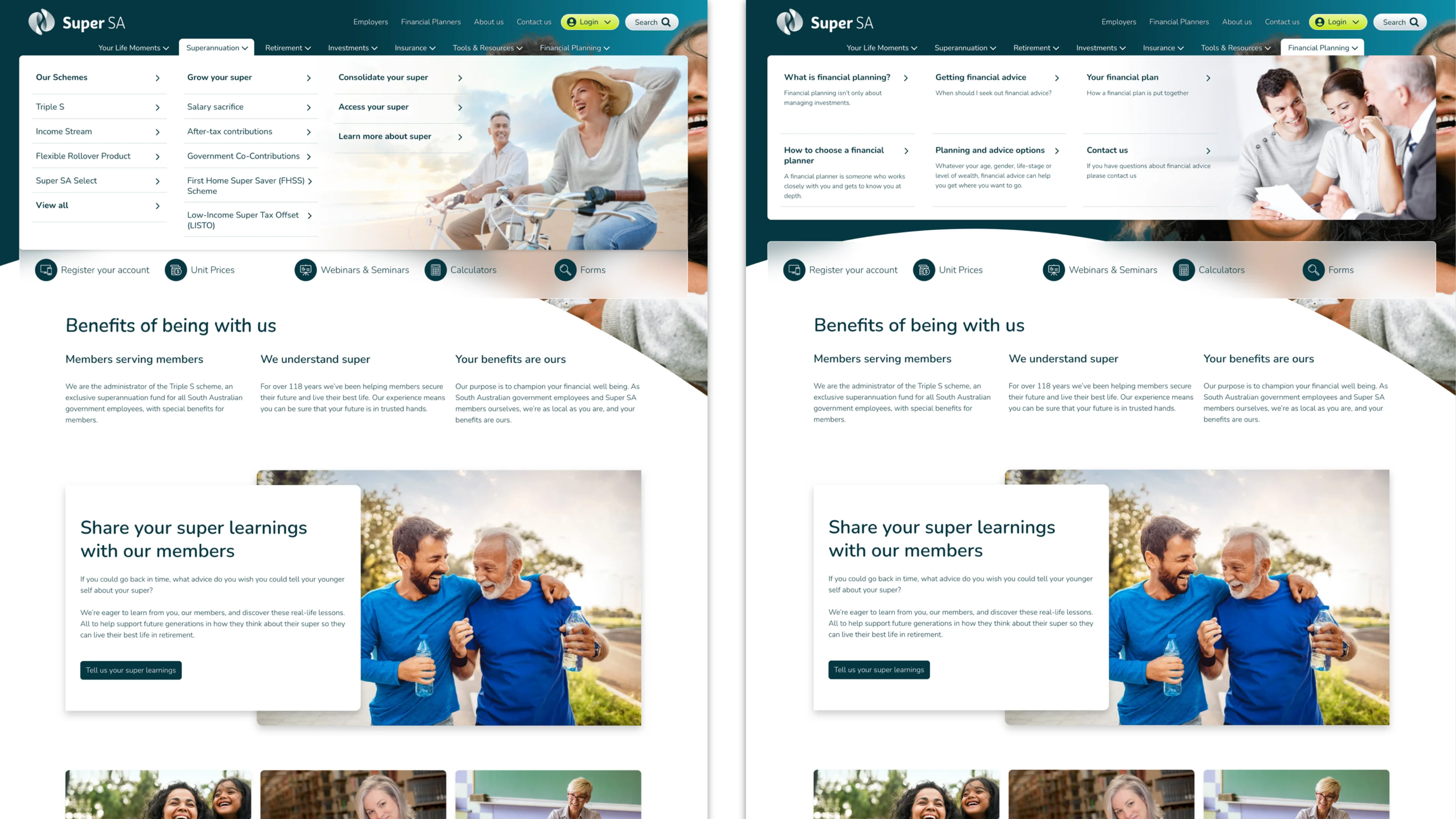
Super SA is the superannuation fund for the South Australian public sector. They have over 300,000 members and $30 billion in funds under management. New legislation had been passed to allow South Australian public servants to use any superannuation fund as opposed to the traditionally mandated, Super SA.

Super SA now needed to compete in the financial markets, invoking a knee jerk reaction from the board. Until this point they had never really needed to compete and their web site indeed was indicative of this, promoting the organisation and not the products.

The Super SA web site was designed to be completely responsive, ensuring all desktop functionality was provided on mobile.

I came to this project late, taking over the role of Senior UX consultant during the wire-framing phase, seeing out the completion of the wire-frames, layouts, style and navigation. I also worked on the front end development of the project with the development team. The site built using Optimisely and Tailwind CSS.

The talented team that worked on this project did months of long hours to get it done in the very short time frame for a site of this complexity, generously subsiding the cost of the project for Empired and SuperSA to bring it in on time and on budget.

Multi-award winning

The project was a success and the new site was launched in June 2021, winning 3 awards, including:

  • 2022 Optimisley Award for 'MOST INNOVATIVE EXPERIENCE'
  • 2022 DRIVENxDESIGN Gov Design Award (Digital - Finance category)
  • 2022 Better Future Design Silver Award - Digital Finance

Super SA Home Page

Super SA home page

Super SA Home Page

For Super SA, 99.6% of users went to the site to check their balance, but we didn't have the scope to build that experience for customers. We could only design the site for prospective customers and even then the home page was still fairly organisationally, inwardly focused leaving in a section for 'latest news' but leaving the 'performance' section as a secondary navigation item.

To me that's backwards. The performance of the fund is the most important thing to a prospective customer, where as the latest news is not. The analytics clearly show that very few people actually read the latest news section, most likely limited to those within the organisation.

Super SA Navigation

Examples of the different navigation formats for Super SA

Super SA Navigation

The navigation was designed to be a major part of the engagement of the site, giving Super SA the ability to choose images for each section as well as choose the format of the navigation, depending on the content of the section.

Super SA Performance Section

An early iteration of the Hearing Australia booking process analysis.

Super SA Performance Section

The performance section of the site was designed to give prospective customers a quick overview of the performance of a fund using dynamic graphs and charts.

Back to folio

Services Australia CITADEL App

Service Australia
Senior UX Designer
2017-2020

Starting in 2017, I worked on a few different projects at Services Australia, starting with 'Veteran Centric Reform' a very large and politically charged project to reform the back office software for the Veteran's Services. I then worked on some 'Compliance' software for collecting financial data and finally moved to the Data Analytics and Research Centre (DARC).

Services Australia Logo It became clear that 'UX' was not well understood by Services Australia. IT at Services Australia relegated the role of UX to a 'compliance' role. The UXers responsibility was to review the software that had been completed and ensure that:

  • The language was not too complicated
  • The headings, labels and the punctuation thereof were used consistently
  • The app reached a AA level of Accessibility

Things like suggesting clearer layouts, better navigation, more intuitive interactions, were not part of the UX role at Services Australia.

An instance of the Darc Web team which changed several times over the course of delivering the app. That's me on the right.

After 9 months I was sent to the Data Analytics and Research Centre (DARC). Research was being conducted in the areas of AI and data science and they used AGILE, which was pretty new for the Services Australia at the time.

This was all part of a vision to create a Services Australia 'Data Lake' - a place where all of Services Australia's data, which is mostly sensitive, personal data, is securely collected, stored and processed. This would allow for a huge gain in organisational efficiencies, providing line-of-site to data metrics, origination and quality.

Services Australia already had a lot of data and data sources that, for the purposes of transparency and accountability, needed to be clearly tracked within a register. If a minister was asked about the nature of the data Services Australia collects about the Australian people, the the Minister should be able to answer that question.

Services Australia already had a lot of data and data sources that, for the purposes of transparency and accountability, needed to be clearly tracked in a register.

The Chief Data Officer (CDO) was tasked with creating a register of all the data sources and data sets that Services Australia had. To do this they decided that a table in SharePoint was the best approach. It was audited and the report showed that the Sharepoint table failed to provide the level of transparency, detail and accuracy required.

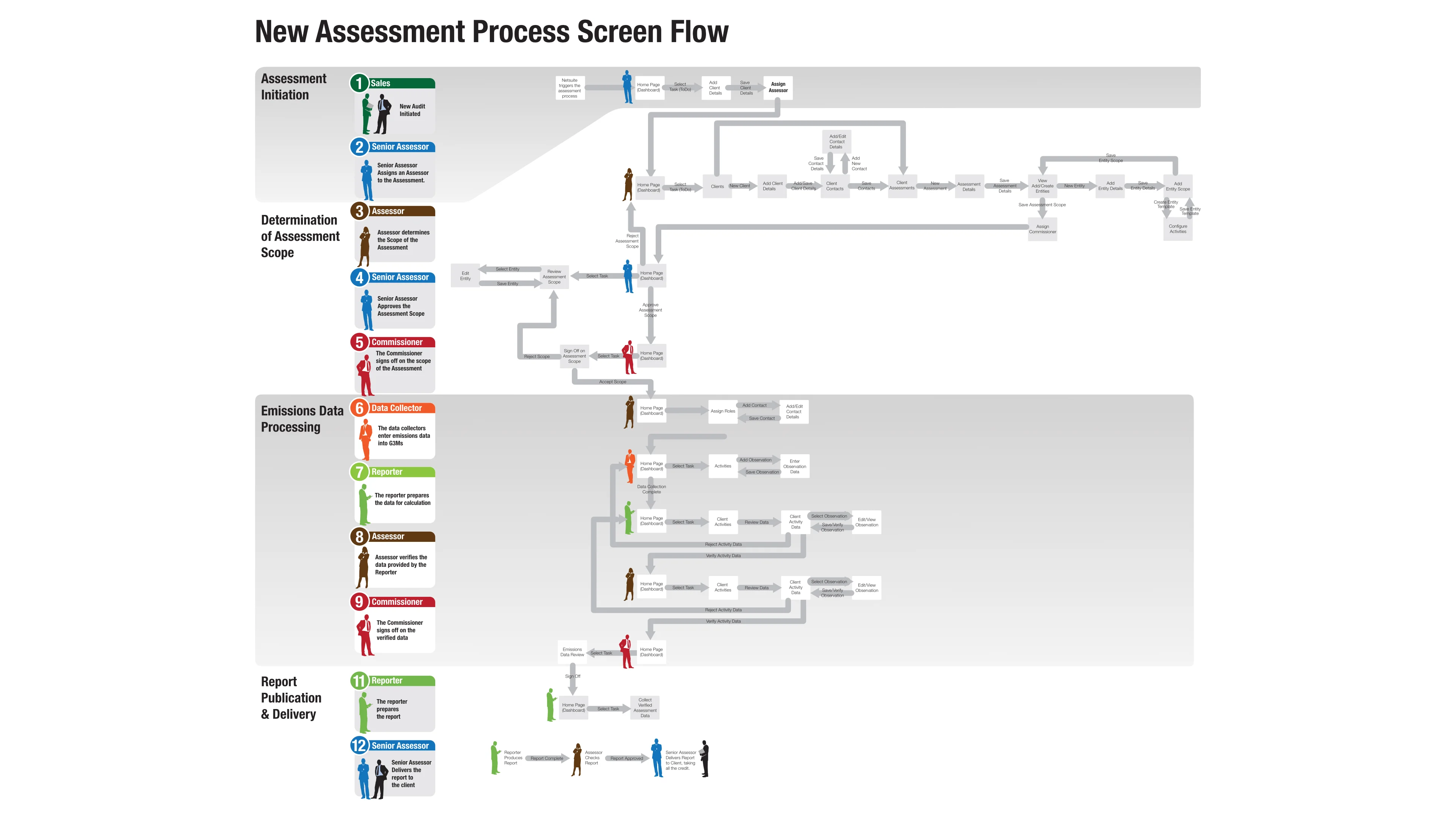
I was asked to design an app that would support the process of registering and managing data exchanges and data sets. The app was given the name, CITADEL which was an acronym for 'Customer Information Through a Data Exchange Library' (not my idea) and would become a front-end for the Data Lake project.

I carried out the discovery and design for the app. Interviewing people that already manage exchanges and creating process flows and wireframes. I then created a design system and prototyped all of the views that were then implemented with Angular and carried out with AGILE.

Half way through the project, Services Australia mandated the use of the official design system that had just been released. So we pivoted quickly to adopt the new design system. I assembled all of the views in Angular, with the team implementing them in a single sprint.

CITADEL was universally regarded as 'better than the Sharepoint table' and so was considered a great a success.

There are a few headwinds that come with working for the Australian Government. Too many meetings and project direction can be easily swayed by political whims. Despite all that, my team known as 'Darc Web' (who I loved) delivered. CITADEL was universally regarded as 'better than the Sharepoint table' and so was considered a great a success.

My experience working for Services Australia at DARC was very good. I had many very talented colleagues, and many insightful conversations, giving me a deep insight into the workings of the Australian Government and the challenges it faces. IT probably being the primary challenge. Haha.

* I remember a casual lunch conversation with a front-liner (a person that deals directly with customers) who rolled her eyes and shook her head when I mentioned I was working on improving the compliance software for collecting financial data. The last time they upgraded the software that she used, it was a disaster for their department. Apparently this was a common occurrence at Services Australia.

Back to folio

OPTUS

Optus
Senior UX Designer
2015 - 2017

Optus were investing heavily in IT in 2015. They had reached a point where the patchwork set of 24 apps used for managing customers had been deemed a competitive liability and they were looking to replace them with a unified system that by the time I was employed there, it was years late and $150M over budget.

The Optus Personal Hub Logo
One of the more fun aspects of working with Optus was their propensity to brand projects and apps. This was the logo for the Personal Hub, which was a Facebook-esque app that was used for internal comms, staff training, staff awards, articles, calendar and notifications.

I was employed to join a small, yet talented R&D team as a designer to assist with designing/presenting/building new ideas and strategies.

Over the next couple of years I worked on about 24 separate projects, some requiring conceptual and exploratory work, others being fun graphics work and others being full blown front end development. Like most large organisations, when you earn a reputation for design and graphics, you get asked to do a lot of bits and pieces for lots of different jobs.

The Optus 'Build My Offer' Fixed Line Services Quoting app was a Salesforce integrated app that allowed sales people to create quotes for fixed line services. It was designed to be a simple, step-by-step process that would allow sales people to create quotes for complex offerings, with multiple products for multiple locations for customers in a matter of minutes.

Optus turned out to be a great place to work. The people on my team were talented and supportive. The projects were engaging and challenging and the culture was fun and relaxed.

Optus Personal Hub Awards

Optus Personal Hub Award Icons

Optus Personal Hub Awards

Optus wanted the ability to allow their staff to hand out awards to each other for good work. I designed these over the course of a couple of days, keeping the tone inline with the culture of the Optus call centre, where I was ensconced.

Optus Personal Hub Reskin

Conceptual layouts for the Salesforce Personal Hub reskin for Optus

Optus Personal Hub Reskin

The main thing I was initially employed to do was to reskin the Salesforce Personal Hub app, which was a Facebook-esque application, the functionality of which covered internal comms, staff training, staff awards, articles, calendar and notifications.

This was carried through developing a clickable prototype in AngularJS, which was then handed over to the Salesforce devs to extract what I had done and implement it into Salesforce.

Optus 'The Loop' Product Information Hub

Optus 'The Loop' internal product database and comms app.

Optus 'The Loop' Product Information Hub

To be integrated with the Personal Hub, Optus wanted a product information hub that would allow staff to access information about products and services that were constantly changing and being updated. This app was designed to be a one-stop-shop for all product information, including product specs, pricing, deals and offers, while at the same time creating a feed of updates to keep the staff informed of product changes.

Optus 'Elevate' Process Flow

Optus 'Elevate' app process flow.

Optus 'Elevate' Process Flow

Optus has a lot of stores owned by franchisees and it's important for the Optus brand that these stores are kept up to date and in good order with the latest collateral. The Elevate app was designed to assist Area Managers with inspections, providing some calendaring and location functionality, the ability to create reports with photos, as well as provide guidance to the franchisees on how to improve their stores and sales.

I also designed a section called 'Administration and Reports' that allowed higher ups to get an overview as to the state of the stores and the progress of the Area Managers. Although this was never included.

Optus 'Level Up' Dashboard

Optus 'Level Up' dashboard.

Optus 'Level Up' dashboard

I was asked to come up with a strategy for improving over-all sales performance at Optus. I came up with a two pronged approach. The first was to create a dashboard that would allow staff to see how they were performing against their peers. The second was a discussion based knowledge sharing system that would allow sales people to share their approaches and strategies, creating celebrity and competition.

Optus 'Build My Offer' Fixed Line Services Quoting app

Optus 'Build My Offer' Fixed Line Services Quoting app.

Optus 'Build My Offer' Fixed Line Services Quoting app

The Optus 'Build My Offer' Fixed Line Services Quoting app, was a Salesforce integrated app that allowed sales people to create quotes for fixed line services. It was designed to be a simple, step-by-step process that would allow sales people to create quotes for complex offerings, with multiple products for multiple locations for customers in a matter of minutes.

This was perhaps my favourite project at Optus because I was able to design the app from scratch, create HTML/CSS/JS prototypes of my designs and iterate those designs organically with the team and the stakeholders.

Typically, during development when clients watch an app start to come together, they have a tendency to gain deeper, clearer insights into their own processes and needs that weren't detailed during the requirements phase. However, when you design in the browser, you can respond to these insights and needs as they come up and include them in the next iteration of the design, ensuring a better result is obtained.

Designing with coded prototypes can initially requires a greater effort upfront than using graphics apps for demonstration purposes because the interactivity of the UI also needs to be designed and implemented while coding the UI.

Once the layouts have been initially developed, iterations can be implemented quickly and easily. Versions of the UI can be tracked, universal changes are simple to implement, a design system naturally takes shape, the UI can be tested for accessibility and usability and the UI can be handed over to the developers for implementation, saving them oodles of time and the stakeholders oodles of money.

Back to folio

Carbon Planet

Carbon Planet
Design Manager
2006 - 2011

There was a time, well within living memory, when Australia was on the cutting edge of climate change action. Our government, at the time, had not only embraced the climate science but had implemented a carbon pollution reduction scheme, that was literally called the 'Carbon Pollution Reduction Scheme' (CPRS).

Carbon Planet was originally a start-up, 'carbon credit retail business' started by Dave Sag and Ross Williams. I was brought on board to help them with their web site and business collateral. I had history with both Dave and Ross, having a neighbouring office with Dave Sag and having worked with Ross Williams quite a bit in the past.

Soon Carbon Planet found another large investor (and friend and previous business colleague of Ross Williams), Jim Johnson, that was so enamoured by the concept he came aboard as Managing Director, raising a lot more investment capital and taking the company in a new, global direction, going from a simple retail business to a global carbon credit origination and trading company.

Carbon Planet Sales Collateral Image Due to the heat in the market and the new regulatory landscape, there was a lot of green investment money 
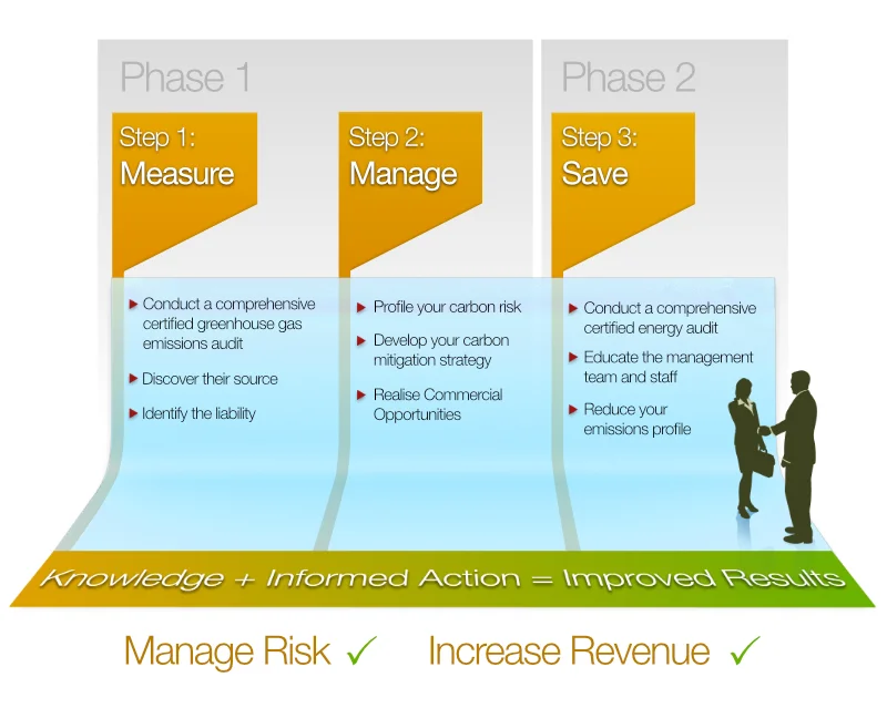
floating around and Carbon Planet started developing a software platform to help business to 'Measure, Manage and Minimise' their energy and carbon (equivalent) emissions. They called it 'G3MS'.

When it started, it wasn't really a political thing. It was just a nice business idea. Ross Williams had constructed a small business that was basically saying, 'Hey, if you want to offset your carbon emissions, carbon credits are a simple, reliable and cost effective way to do that. Him and Dave Sag were of the first to offer that as a service.

Back then, if it weren't for the legislation, the carbon industry would have been non-existant. So you can imagine my surprise when the following government, led by Tony Abbot, framed the whole thing as a 'tax grab' and pledged to get rid of it.

My role in all of this was to design and create all of company collateral, which included their online retail store, web sites, corporate and sales collateral, educational, community outreach material. I even wrote a script for a comic book and submitted 2 papers to the COP15 Climate Change Conference about the best places to originate Carbon Credits.

Carbon Planet was truly a wonderful place to work. There were several Climate Science PHDs, a lovely team of software developers, an amazing marketing and community outreach team, a great team of sales people and an overall, company-wide desire to do good.

Carbon Planet Web Site

The Carbon Planet Landing Page

Carbon Planet Web Site

I designed and built the Carbon Planet web site. It had over 100 information pages on climate change, and even years after the company had stopped trading, it was still getting around a 1000 hits a day.

It also contained all of the Carbon Planet sales material and collateral, published scientific documents and an online shop where customers could purchase educational material and carbon credits to offset their daily carbon emissions. The site was built with Ruby on Rails with no CMS as I was managing the content myself.

Carbon Planet Web Content

Carbon Planet Info Graphics

Carbon Planet Web Content

Carbon Planet had a lot of information on their web site. I designed the layout of the content pages to make it easy to read, navigate and browse.

Carbon Planet G3MS UI

Carbon Planet G3MS UI

Carbon Planet G3Ms UI

Carbon Planet developed a web application for businesses to measure, manage and minimise their energy and emissions usage. I designed the UI for this app, which was built in Ruby on Rails. The dev team had spent a year getting the requirements and business logic right, but had no idea how to design the UI, releasing the 1.0 version to customers with a very poorly thought out UI.

I complained to the CTO at the time who had been overseeing the development of the application. I was pretty harsh with my assessment of the UI, saying it was confusing, ugly and unintuitive. I thought he'd ask me to come up with something better, but instead he just shrugged and said he thought it was ok.

However it wasn't long before the feedback from customers started coming in and it was all very negative and, begrudgingly, the CTO asked me to come up with something better. I designed and prototyped the UI in HTML and CSS in 2 weeks. It was immediately adapted.

Carbon Planet G3Ms Roles and Permissions

Carbon Planet G3Ms - Roles and Permissions

Carbon Planet G3Ms Roles and Permissions

The devs were having trouble defining the scope of work to be done so I created a Roles and Permissions diagram to make clear the different user types and what they could do.

Carbon Planet G3Ms Process Flow

Carbon Planet G3Ms process flow.

Carbon Planet G3Ms Process Flow

This document was designed to make clear the process, from start to finish, of how a business would be approached, engaged and the process for determining a scope of work for carrying out the energy and emissions audits.

Formalising a flow in this way brings everyone involved in the processes together, allowing them to see the big picture and understand how their role fits into the overall process, giving the devs a clear idea of what they needed to build.

Carbon Planet - The Selective Logging Carbon Cycle

Carbon Planet - Diagram of he selective logging carbon cycle.

Carbon Planet Diagram of the Selective Logging Carbon Cycle

Carbon Planet hired several PHD climate scientists to determine and assess the science behind the carbon credits. I was tasked with creating a diagram that summarised the emissions of selective logging.

I used a lot of 3D modelling and rendering to illustrated the different by-products of the process and how carbon was sequestered or released into the atmosphere as a result.

Carbon Planet Infographics

Carbon Planet Info Graphics

Carbon Planet Infographics

A great thing about the carbon industry was the emphasis on data and information. Climate science is a very data driven discipline and I was able to create a lot of info graphics to help explain the science and often the legislation behind the carbon accounting.

Carbon Planet - Carbon Liability Graphics

Carbon Planet Carbon Liability Graphics

Carbon Planet Carbon Liability Graphics

There was a time, long ago, when the Australian government actually had implemented a carbon mitigation scheme. It was called the 'Carbon Pollution Reduction Scheme' and it was a cap and trade scheme. Believe it or not, Australia used to be on the forefront of climate change mitigation.

This was not an easy thing for people to understand, so I created a series of info graphics to help explain the process and to convince business it was a good idea to engage in carbon accounting.

Of course, when the Abbot government was voted in on the platform that the CPRS was a 'tax' that would make a leg of lamb cost $100 (all lies), they scrapped the CPRS, killing the carbon industry in Australia replacing it with nothing.

Planet Saving Super Heroes Comic Book Art

Planet Saving Super Heroes Comic Book Art

Planet Saving Super Heroes

The original cover for the comic that I designed.
This was my initial approach to the comic in my own quirky style.

Part of the community outreach strategy was to create a comic book that would help explain the science of climate change to kids.

At first the task was left to me. I wrote a script and started to illustrate the comic. However, I soon realised I was in over my head so I approached a professional comic book artist, the venerable Nahum Ziersch to illustrate the comic for us.

Nahum was fantastic to work with. He was very open to my ideas, got the work done quickly and was really cool with feedback.

Back to folio

Web Design and Development

Various
Designer/Developer
Various

I started in web development in 1996 and over the years have designed, developed and deployed a large number of web sites, apps and dashboards for various clients, small and large.

The first web site I hand coded way back in the 90s. Wendy's is now called "Wendy's Milk Bar" and their site lacks some of the charm of the original web site, if I may say so myself.

In the early days there weren't any set ways to approach a project and we made it all up as we went along, running into all of the complex problems that come with software development and figuring out how to solve them ourselves.

I adopted the belief that the UI completely covers the functional scope of a human centric software application. If you prototype the UI first, the devs and stakeholders won't struggle to understand what is to be built and the project will run smoothly and be delivered on time. This approach works well and it's how I work to this day. It's called, 'Software UI Architecture'.

AGIG Dashboard Design

AGIG Dashboard Design

Australian Gas Industry Group (AGIG) Status Dashboard

These layouts were put together with part of the monthly budget that AGIG had with Empired. AGIG were managing this information with Excel. However, it's more desirable just to have a page where all this information was always accessible and live.

South Australian House of Assembly Kiosk

South Australian House of Assembly Kiosk

South Australian House of Assembly Kiosk

The South Australian house of Assembly had a kiosk that was used to display information about the members of the house. I was asked to design the UI. It was going to be situated in the members lounge that had been beautifully decorated and I wanted it to keep the theme of the room.

I designed the layouts to suit the room that the kiosk was in.

James Knowler Web Site

James Knowler Photography Web Site

James Knowler

James (Jimmy) Knowler is a prominent Adelaide photographer/videographer who has been working around the traps for a long time.

He has a very pragmatic approach to his work and is very easy to work with. He wanted a simple web site that automatically showcased and organised his work when it was added. I facilitated this with a Wordpress site, using the 'Bones' theme as a starting point.

Pop Up Medics Web Site

Pop-up Medics Web Site

Pop-up Medics Web Site

Pop-up Medics is a small business that provides first aid and medical services for events. They wanted a simple web site that would allow them to showcase their services and provide a way for people to contact them. The site didn't take long to build. It was Wordpress install using the 'Bones' theme and 'Advance Custom Fields' extension for the CMS.

Wiseman Design Web Site

Wiseman Design Web Site

Wiseman Design Web Site

Jason Wiseman is a talented furniture designer/maker. He wanted a simple web site that would allow him to showcase his work and provide a way for people to contact him. The site didn't take long to build. It was Wordpress install using the 'Bones' theme and 'Advance Custom Fields' extension for the CMS.

I have commissioned Jason to make a few pieces of furniture for me and I can attest to the quality of his work.

Workspace Web Development

Workspace Web Site

Workspace Web Site

I was employed full time to work for Atomix, a fairly typical, mid-sized Adelaide web studio struggling to make money. I was made the lead developer for this job as the design had already been sold to the client.

The site was an e-commerce site with hundreds of products. It was the very first completely responsive web site that I built and they gave me 6 weeks to do it. It was a stretch, but I made it.

I enjoyed my time with the team at Atomix. They had a great handle on Word Press and I learned a lot about it while I was there.

Back to folio

The Pup Bed

Self
Designer
2021

So my old dog, Penny, had become sad about the state of her back. She had developed spondylosis and her back legs weren't working properly. She was having trouble getting up and down, was in a lot of pain and I wanted to get her a more comfortable bed.

Penny at the park with a ball in her mouth
My dog, Penny (Pennikins) at the park playing fetch.

Of course a Google search for a decent looking dog bed came up bupkis, as it does these days, only showing ugly, cheap, impractical beds from their advertisers. So I decided to design and make her one. I wanted it to look like a piece of furniture that matched the decore of the house.

I wanted it to be warm in winter, cool in summer and slightly raised off the ground because she seemed to like being up on the couch. I also wanted to be able to remove the cushion covers so they were easily washable.

I used a combination of 3D modelling and 2D drafting to design the bed. I used Blender 3D to model the bed and then printed the design to test it.

Penny modelling the bed.
Penny begrudgingly modelling for me in the bed I designed and built for her. She doesn't like it and refuses to sleep in it.

I thought it would be a fairly simple process of designing the bed and then getting it cut out on a CNC machine, but I was unable to find anyone in Adelaide willing to cut it out for me, demonstrating Adelaide's lack of skill in this area. One firm told me it would cost $2000 just to set it up. Given that it takes about 20 minutes to set up the gcode in Fusion 360, I thought that was a bit steep.

In the end a friend of mine that runs a fabrication workshop in the US, that had been fabulously supportive throughout the entire process cut it out for me. It came together well for a prototype. Everything fit together nicely and it was very sturdy. I was very happy with the result - except that Penny didn't like it. She didn't like the height of it and she didn't like the cushion. I had to make her get on it for the photos.

If I was to design it again, I would make it a little wider and a little lower and simplify the shapes to be more efficient with the wood.

Pub Bed Designs

Pup bed plans

Pup Bed Designs

These were from a document I put together to send to the CNC fabricator. I used Blender 3D to model the bed and then printed the design to test it.

Pup Bed Prototypes

Pop-up Medics Web Site

Pup Bed Prototypes

To make sure that my design actually worked I printed it out on the 3D printer and assembled it first.

Pup Bed Construction

Wiseman Design Web Site

Pup Bed Construction

Here is the finished prototype. I was happy with the result but unfortunately Penny wasn't.

The Pup Bed with Penny

Wiseman Design Web Site

Pup Bed with Penny

Here is the finished prototype with Penny. It looks big enough for her but the bed was also designed to fit in our hallway and hence was a little more narrow than she was used to.

The Pup Bed with Mizzy

Wiseman Design Web Site

Pup Bed with Mizzy

Here is the finished prototype with Mizzy. Mizzy loved the design and was really supportive from the start. She commandeered the cushions long before the frame was complete.

Back to folio

The Radius Desk

Self
Designer
2012

I needed an island desk that was able to adequately manage all of the cables that my home computer set up had. This included power and data cables for the computer, display, printer, scanner, tablet and chargers etc. Without cable management the all of the cables were exposed and it was a mess.

I put this video together to show the desk in action as well as the carcass and ventilation. The whole process came together in an afternoon.

Back in 2012, a deep online search looking for island desks with cable management came up with nothing. This annoyed me because The IT revolution had happened already and there was no office furniture vendors out there with a built in solution for managing several powered devices on a desk, beyond a hole in the desk for the cables to fall through.

I got my tape measure and started measuring up the space I had to work with and went about modelling the desk in Blender 3D. I measured all of my devices as well as obtaining the dimensions of the largest computer tower cases on the market at the time, coming up with a design that was able to house all of my devices, fit two large computer tower cases behind the drawers, provide adequate ventilation for them, manage all of the cables connecting and powering them and fit through the door.

This video shows the assembly of the carcass of the desk. I was trying to show the carcass assembly if it was to come from a single sheet of MDF.

I commissioned Jason Wiseman to build it. He was a good fit for this project because he had designed a built a lot of specialised AV furniture and understood where I was coming from, borrowing the cable management technique for some of his subsequent designs.

I have had it for about 12 years now and it is still great to use.

Radius Desk Design

Radius Desk Design

Radius Desk Design

Once I knew what my approach would be, I modelled the desk in Blender 3D. It only too about 4 hours to model the desk and animate the concept. Starting top left and going clockwise:

  • Top left: An exploded view of the desk exposing each of the shapes required.
  • Top right: Front view of the desk with the cable hatch open.
  • Bottom right: Rear view of the desk with the all openable things open.
  • Bottom left: The shape of the face frame of the desk.

Radius Desk Finished

Wiseman Design Web Site

Finished Radius Desk

Here is the finished desk. It's a lot tidier in these shots than it is right now, but it gives you a good idea of what it looks like and how pleasant it is to work at.

Back to folio

The Happy Side Table

Self
Designer
2019

There are times when you know exactly what you need for your house. We had been using the housing for a sub-woofer that came with the AV unit for the TV as the side table between two arm chairs in the living room, but I couldn't store anything with it.

As with everything I design for the house, it started with a disappointing Google search for a side table that suited our needs. Typically Google only showed the wares of it's largest advertisers, who due to their lack of taste, quality and innovative ideas, need to spend a lot on advertising so they don't go broke. Google favours it's advertisers in search results so it's difficult to find anything nice and I was forced to design my own.

The Happy Side Table in situ
The design was made specifically to fit between two arm chairs that are central to the room, so I wanted it to be accessible from both sides.

As far as side tables go, this is not typical. It has two fronts because it doesn't go up against a wall, instead being situated between two arm chairs. The drawers keep things like glasses, remotes and game controllers handy. The design resembles a happy anime face because I love a bit of whimsy, and to match the style of another piece of Jason's furniture that we have.

Once again I turned to Jason Wiseman to build it.

Happy Side Table Schematics

The Happy Side Table Design

Happy Side Table Schematics

My initial design was too small for the drawer sliders that Jason had, so I made the table bigger than shown here to accommodate them. The larger size actually made the table more functional.

Finished Happy Side Table

Finished version of the Happy Side Table

Finished Radius Desk

Here is the finished Side Table.

Back to folio

Isometric Black and White Illustrations

Self
Illustrator/Artist
2002 - 2004

This series of images were created in the early 2000s. I was pretty much exclusively using computers to create art back then bar a simple thumbnail sketch to remind me of the idea. Once I started to create the images, they had a tendency flesh themselves out.

Most of these images were created using 'Freehand' by Macromedia, which was a vector based drawing program. When the image lines were complete I would move the image into Photoshop to add more shading and highlights using a tablet to sketch in the details.

Vase

Vase

Vase

This is a depiction of a vase we had, seemingly made from stone, situated on the corner of our coffee table at the time. I liked the simplicity of this image. It was kind of an easy thing to draw.

Hotel de Love

Hotel de Love

Hotel de Love

Not sure where this actually came from. It was an early one. I think I was just trying to create a scene with a bit of depth and had just finished watching the Australian movie ' Hotel de Love' which I loved and crushed hard on the leading woman, Saffron Burrows.

Radius Place

Radius Place

Radius Place

A whimsical scene of a compact place that would be nice to live in. Replete with pool, shed and barbecue.

Villa de Villa

House de Villa

Villa de Villa

I went through a phase of imagining what a sustainable place would look like. To me a small footprint was key, to allow for more green space. Using the height and the roof for more outdoor living space and garden area. I also feel that a small vegetable garden is important for those that like to cook. This was the first of those designs.

Flower Building

Flower Building

Flower Building

Around the time I was illustrating these ideas, an art group called 'Blast Theory' were running a show in Adelaide. They had a piece called 'Can You See Me Now?' which was a game that was played in the streets. While they were running that I was given the opportunity to try out for a chance to work on another project they were working on for the London Science Museum.

They provided a brief that had several tasks and I could choose one to respond to. The task was to illustrate a building that opened up like a flower. This illustration was for that and it won me the job - and yes I did have my work on display in the London Science Museum.

House de Villa

House de Villa

House de Villa

I went through a phase of imagining what a sustainable place would look like. To me a small footprint was key, to allow for more green space. Using the height and the roof for more outdoor living space and garden area. In this design, the staircase in the far tower goes the entire height of the building offering a passive cooling system.

City Park

City Park

City Park

This was a concept for sustainable city living. The idea that the buildings themselves provided essential outdoor spaces for the residents. The park was a place for the residents to relax and play. The buildings were designed to behave as entire neighbourhoods with their own shops, services and schools.

Friends

Friends

Friends

This was created because one of my friends at the time socially crash landed on the same island as me and we became close.

Heart in a Cage

Friends

Heart in a Cage

This was created because I was beginning to understand myself a little better. The heart depicted here, while secure, is also isolated. At the time I saw this as a personal thing but I realise now it's a fairly standard part of the human experience.

Graffiti

Friends

Graffiti

A friend lent me the book, 'World of Graffiti' and it had some jaw dropping 3d street art that looked like inspired me it was floating in the middle of the scene where it was added. That inspired me to create this. Based on my name, my appreciation for optical illusions and M. C. Escher.

Heart Pulled Out Back

Friends

Heart Pulled Out Back

I created this as an expression of how I felt about being moved on from a group of friends that I dearly valued.

Back to folio

The Squeaky Team

Self
Designer
2012

So I was doodling one day and I scrawled a little character that I called camel, the orange character. I modelled that in 3D because it was so easy and started to experiment with lighting and textures to get a nice subtle gradients on the surfaces. Soon the small red character, Ducky, was born, followed by the big, light blue character, Bear.

Here is Camel.

I expanded the character set out to 9 characters and set about developing dozens of compositions with them. I had an exhibition with about 40 pieces in it and sold all the small ones. I printed out 6 really big ones but only sold one, which in hindsight was a pretty obvious outcome.

I wanted people to put themselves into the compositions. I wanted them to see themselves in the characters and the situations. The characters ended up taking on their own personas and I was commissioned to design a pink character (Pinky), for a woman's niece.

Birdy

Pup bed plans

Birdy

Camel

Pop-up Medics Web Site

Camel

Pinky

Wiseman Design Web Site

Pinky

Ducky

Wiseman Design Web Site

Ducky

Terrier, Dragon, Crocky, Cowie and Bear

Terrier, Dragon, Crocky, Cowie and Bear

Terrier, Dragon, Crocky, Cowie and Bear

All the Squeaky Team

Terrier, Dragon, Crocky, Cowie and Bear

All The Squeaky Team

All the Squeaky Team

All the squeaky team

All The Squeaky Team

Yeah - so you get the picture. My aim was to evoke emotional responses for each of the characters as individuals as well as the whole team. There are a lot of these in many differing compositions and formats.

Back to folio

Logos

Various
Designer
2000 - 2016

I think if you have a background in Graphics and you're good with computers, you will have been asked to come up with a logo at some point. Pretty much all of these were professional requests from friends. It can be handy having a cheap source of graphical development in your network.

Australian Champions League

Australian Champions League Logo

Australian Champions League

A friend of mine started a League where all the country clubs play each other in a one day round robin for football and netball. I think it's still going. I did the logo and the website.

Look Mum No Hands Catering

Look Mum No Hands Catering Branding

Look Mum No Hands

A friend of mine started a catering company and I this is what I came up with.

Mills Contract Building Logo

Mills Contract Building Logo

Mills Contract Building Logo

A friend of mine has a construction business. I took about 10 minutes out of my day to give him a logo for his signage.

Riverside Creamery Logo

Riverside Creamery

Riverside Creamery Logo

A friend of mine was running sheep up in the Barossa and wanted to become a sheep dairy. She was non-plussed with this approach because it felt too old fashioned. I mean, sure, it's a bit old fashioned, but the nice thing about packaging these days is that you don't need to have a logo that is a one colour hard edged block anymore. You can get away with using a pleasant illustration - which I felt would improve the shelf appeal.

Riverside Dairy Logo

Riverside Dairy Logo

Riverside Dairy Logo

The same friend that didn't like the Riverside Creamery logo asked for something like this one - a single colour hard lined block. I quite liked how it came out on the packaging. The I tried the yogurt and the halloumi which were really good.

Riverside Farm Logo

Riverside Farm Logo

Riverside Farm Logo

I don't know if this logo was ever used. Same crowd as the rest of the Riverside peeps. They seemed to appreciate my approach.

Riverside Smokehouse Logo

Riverside Creamery

Riverside Smokehouse Logo

I don't know if this logo was ever used. My friend Kane, would come up with a business idea and then say, can you do a logo for me? And I would whip one out in a jif. He was always happy with the result.

Sanbama Agencies Logo

Sanbama Agencies Logo

Sanbama Agencies Logo

Friend had a haberdashery store and wanted a logo and a web page with their details on it.

Storyism Logo

Storyism Logo

Storyism Logo

An old colleague was consulting in UX and asked me to do a logo/brand for her.

Sustainable Savings

Storyism Logo

Sustainable Savings

The guys from Carbon Planet set up a new business, 'Pangolin Associates'. They were expanding and defining new markets. The asked for a logo for their new business.

Swarm Critic Logo

Storyism Logo

Swarm Critic

Ross Williams, serial business associate, had come up with a new technology for scanning large amounts of text and applying rules when specific text patterns are matched. He had developed an extremely efficient way to do this and was looking to monetise it.

He envisioned this tech to be used for a number of applications, but the first one he wanted to develop was to assist in the editing of large documents. The idea that a business or faculty could all share a set of rules that could be applied to a document to ensure that it was consistent in its use of language and style was very appealing to him. Hence the idea of a 'swarm' which was how he referred to the rule set.

Windows Covered

Windows Covered Logo

Windows Covered

Same crew as Sanbama and The Australian Champions League, started a business in window coverings and asked me to do a logo for them.

Woolcock Group Logo

Woolcock Group

In the early 2000s a friend recommended me to his dad who manufactured enormous sheds. They still use the logo.

Back to folio

Food Drop

Recall Design
Senior Designer
2000

Way back when the internet was still running on 56kbps modems, I was lucky enough to undertake some projects that were ahead of their time. Food Drop was one of those projects.

By 1999 there had been some very large investments in the US to get people to order their groceries online that had failed catastrophically. Maintaining the enormous stock database with all the suppliers in those days was a big ask requiring a huge investment, not just in the software and infrastructure, but also the marketing to get people to use the service.

Food distribution is an ancient business that had been commandeered by the supermarkets. While initially it promised fresher food and better prices, the supermarkets had become the gatekeepers of food distribution and were using their power to gouge both food producers and customers for more profit.

The initial web page for Food Drop
This was the first page we put up for Food Drop. It was a simple page that allowed people to register their interest in the service. I find it pleasing to see it rendered in Netscape.

Warren Cosgrove, a down to earth bloke with a strong entrepreneurial streak, came into Recall Design with an amazing plan. He was a food producer himself, processing chicken for Steggles, and was frustrated by the heavy handed control the supermarkets imposed on food producers. He had many friends in the industry all of which were suffering enormous pressure from the supermarkets.

Warren's nephew worked for Sun Microsystems at the time and was able to give Warren advice about the technology that was available and how it could be used to create a food distribution system that could bypass the supermarkets and put food distribution into the hands of the food producers, creating a fairer, more sustainable food distribution system.

Interviews and meetings with food producers had to happen in secret. If the supermarkets knew these meetings were taking place the food producers would be punished by the supermarkets who would not tolerate a food producer attempting to end their reliance on supermarkets, let alone infringe on their market share. The supermarkets would either cease to stock their products or change the shelving arrangements to make their products less visible to customers which could easily put an end to their livelihood.

The Food Cube was a concept for the styrofoam boxes in which the fresh food was delivered
The Food Cube was a concept for the styrofoam boxes in which the fresh food was delivered. The Food Cube would then be returned to the Food Drop warehouse where it would be cleaned and reused.

The business case for Fooddrop was fairly simple. Food Producers were provided with tools for placing and managing their own inventories online, providing nutritional information, product shots and pricing. A public web site presented all of the food producers inventories in a single web site, resembling a large grocery store, but also allowed customers to visit the individual food producers pages.

When customers placed their orders, the food producers were notified of the orders and delivered to a refrigerated warehouse. The food was then packed into containers and delivered via a refrigerated delivery van to the customer within 36 hours of them placing the order.

Without supermarkets taking a huge margin, the food producers were able to sell their food at a competitive price while still earning more than what they could through the supermarkets. Food producers were able to sell their entire inventory through the web site, allowing more specialty foods to be available for the customer.

The customer benefits were also significant. Apart from the convenience of having food delivered to their door, the food was fresher and cheaper than what was available at the supermarkets. The customer was also able to purchase food that was not available at the supermarkets as well as form relationships directly with with food producers, as was the case with me. All food was sourced within 200kms of the Adelaide CBD and was naturally seasonal.

An HTML 4.01 Prototype of the Food Producers Product UI
An HTML 4.01 Prototype of the Food Producers Product UI. The food producers were able to manage their own inventories online, providing all of the nutritional information, photos and pricing. The whole layout was held together in tables, crammed together for 800 x 600 resolution displays, as was the style at the time.

The delivery system was franchised. The franchisee was responsible for delivering the food to the customer in reusable, styrofoam containers. The customer would then return the containers to the franchisee when the next delivery was made. The franchisee would then return the containers to the Food Drop warehouse where they would be cleaned and reused.

Working on the requirements for this project was one of the best professional experiences I have ever had. The ideas for customer conveniences were endless and every meeting was great fun. Food producers that were involved in the project regularly delivered delicious food to the office.

At the end of this process, the business consisted of 4 web sites:

  • The customer web site, fooddrop.com.au
  • Food Producers portal where food producers could manage their online inventories
  • Business Administration web that allowed the warehouse and distribution business to set margins and manage food producer accounts
  • Franchisees portal that provided support and job information for the franchisees

Customer web site features included:

  • 2 shopping lists - regular and previous
  • Customer purchasing history
  • Searchable nutritional information
  • Health information that allowed searches for 'heart smart', vegan, organic etc
  • 'Market day' where food producers could move surplus food
  • 'Daily specials' where food producers could simply mark an item as a special and it would be rotated with other specials in the 'specials' panel
  • Food producer pages - so you could click on a particular producer and see what else they are offering
  • Contact with food producers - you could send them emails, allowing relationships to be formed

Food producer portal features included:

  • Inventory management - activating and deactivating products
  • Pricing and margin management allowing food producers to set their own prices
  • Comprehensive nutritional and food information
  • Twice daily orders sent to the food producers
  • Comprehensive history of product provision

The Business Administration portal features included:

  • Comprehensive reports for all food
  • Margin management
  • Food producer management
  • Franchisee management
  • Customer management
  • Communications management
  • Account management

Franchisee portal features included:

  • Franchisee information and support
  • Delivery management and history
  • Food container tracking
The Food Drop delivery van design
This was the design for the first Food Drop delivery van. I spent all of 10 minutes putting it together before sending it to Warren for approval. I didn't hear back, only to see the actual van branded in this mannor a few weeks later.

It took me 3 months to perform the functional analysis and design the branding and the UI for the web sites, all happening concurrently. At the time, this was considered to be slow by the lead developer, Mike Jenkins, as once the designs were signed off by Warren, Mike Jenkins peer programmed with Andre Biganovski and had the first iteration of all sites complete within 11 days by building his own framework to speed up the development process. Can you even imagine? The sites were then tested and refined over the next 3 months.

From wo-to-go, the project took around 6 months to become an operational business. In it's first 6 months of operation the business gained over 3000 customers, around 40 food producers and had over 2000 items in the inventory. I was one of the customers and I loved the experience. I was on first name basis with the delivery guy, and regularly communicated with food producers. I gained an appreciation for the people that actually make the food I ate and the effort they put into it, that you simply don't when you are a customer of the supermarket. Also the 2 shopping lists were genius - organising a delivery would take me 2 minutes.

The business was making money and there were plans to add a 'meal manager' and a recipe database so that customers could plan out a weeks worth of meals and have the store automatically place the ingredients for those meals in the cart. I was so extremely proud of this project and was so excited to see where it was going.

But all was not well. Warren was under the impression that the site would cost around $50K to build. The site ended up costing closer $250K and Warren had not budgeted for this. Recall were fairly litigious and took him to court when he was unable to pay. Warren lost and was placed on a payment plan.

Warren ran Food Drop on a shoestring budget, stretching all the credit he could muster from the bank and the food producers. He ended up missing three payments to Recall and they took the site down. I was mortified. I asked the managing director of Recall Design if he would consider becoming a partner in Food Drop. He said the board, which was mainly MYOB execs, said they weren't in the business of running food distribution.

I have tried most farmer-centric food distribution services but they all fell short in one way or another:

  • They weren't competitive price-wise with the super markets
  • The food wasn't made to order
  • The food wasn't delivered refrigerated
  • The food wasn't locally produced
  • The food wasn't seasonal
  • There was only a small range of foods to choose from
  • There were no features that made to make the shopping experience simpler, you had to populate an entire shopping list every time
  • If they did make the shopping experience quick and easy, your choices were heavily restricted
  • There was no visibility of food producers or any way to communicate with them
  • The food wasn't delivered in a timely way, sometimes taking a week to be delivered
  • The delivery people would often deliver the food at midnight, leaving it on the doorstep in an open box in the height of summer
  • Product expectations were often unmet, like when I ordered 6 apples, the apples delivered were literally the size of golf balls, destroying my trust in the service

All of the code base for Food Drop still exists and the system could be started up again over night, although, I think the UI would definitely need bit of a spruce given that it was initially designed for a 800px by 600px displays, before the concept of web accessibility had pervaded the industry.

I would like to see a group of food producers get together and start this up again, owning and managing the service themselves, with a goal to spread the business model to other cities, bringing a fairer, more sustainable food distribution service to the rest of Australia, as opposed to the foreign-owned, price gouging cartel we are forced to endure today.

Back to folio

Miscellaneous Graphics

Self
Designer
Various

It's not lost on me that a 'miscellaneous' section is not ideal information architecture, but there are a few bits and pieces that I thought would be nice to show that don't neatly fit into any of the other categories.

Scuba spear fisherman and a pissed off giant fish

A scuba diving spear fisherman hiding his spear gun and pretending he doesn't have a spear gun for a giant pissed off fish that has spotted his spear gun

Scuba spear fisherman and a pissed off giant fish

There's a certain whimsical sense of natural justice that is demonstrated by the hunter becoming the hunted.

Hop in and shop in Roxby Downs

A couple of art concepts for a shopping campaign to get people to shop locally in Roxby Downs, which is a big ask given it's super fucking remote.

Hop in and shop in Roxby Downs

I was asked to come up with 3 different concepts for a campaign for shopping locally in Roxby Downs, South Australia. The two shown here were not chosen.

Neural Fuel

An image of a soft drink can with the label 'Neural Fuel'.

Neural Fuel

This was a joke image about the idea of music being 'neural fuel' except expressed as a soft drink. It came about during a discussion about what kinds of music help you to achieve the 'flow' state of mind when working.

Panic Covid-19 2020

A poster for the COVID-19 pandemic in 2020, saying 'PANIC' and showing an empty toilet paper roll.

PANIC Covid-19 2020

As we all remember, the COVID-19 pandemic of 2020 was a time of great panic buying of toilet paper. If anything foretells the doom of our civilisation, it's the human propensity to avoid critical thought.

In Adelaide, where I live, we have a large toilet paper factory that was running 24/7 to keep up with the panic induced demand. People couldn't resist joining in the panic buying, and one-upping each other, purchasing more and more toilet paper even they already had a 3 month supply at home.

I refused to partake in in the dumb-assery and at one point, of course, ran out of toilet paper when the shelves were empty. This may sound like a disaster but it wasn't actually that hard to get hold of some due to the fact that most people we knew had a minimum 3 month supply and were happy to donate to our desperate cause.

False Narratives, Stupidity, Our Doom

A diagram in the style of an 80s physics high school text book that would ordinarily show how fulcrums work, instead being used to show how society works.

False Narratives, Stupidity, Our Doom

This diagram is a 'joke' about how society works. It explains how to enact something that is very unpopular within civilised society. Common examples being, logging old growth forests, slowing the transition away from fossil fuels, allowing the ultra-rich to avoid paying tax, tolerating poverty, going to war etc.